
When The Rachael Ray Show contacted us in November to ask for assistance with a kitchen makeover for a mother of three school-age children who is battling cancer, the McClurg Team immediately volunteered to help make her dream come true.

Left to right: Tyler Dixon (McClurg Project Manager), John Gidding (architect and designer for The Rachael Ray Show), Scott McClurg, Craig Diego, Theresa Diego, and Paul Thompson (McClurg certified master kitchen and bath designer).
Our employees provided all labor for this special project and worked with celebrity designer John Gidding who revealed the stunning new kitchen to the homeowner during filming of The Rachael Ray Show. Paul Thompson from the McClurg team, who is a Certified Master Kitchen and Bath Designer, worked with Gidding by providing initial drawings of the original kitchen and onsite assistance during construction to help assure that all details were addressed. The project was on the fast-track and took five days to complete.
Project Objectives
The dream kitchen was designed to meet the following objectives:
1. Create a family-friendly space for preparing meals, dining and gathering within the existing space. The timeworn kitchen was a much used space. There was a table placed in the center for family meals and a breakfast bar. The work area was not efficient and work aisles were narrow.
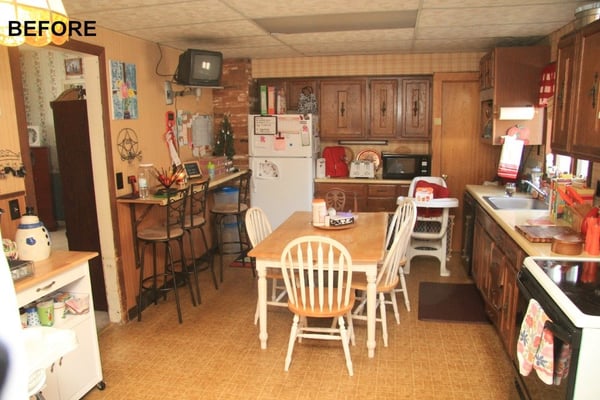
Aisle space and the layout of the original kitchen were not efficient for preparing meals, cooking and cleanup.
2. Replace outdated, inefficient appliances and rework the “Kitchen Triangle”. There were two small refrigerators in the kitchen, which did not provide adequate cold food storage for a family of five. A microwave oven took up precious counter space. The placement of the dishwasher, stove and sink did not provide an efficient work area for cooking.
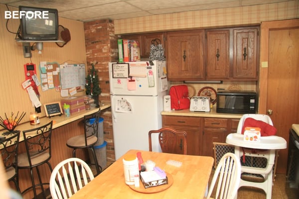
A small refrigerator on the wall of the kitchen with a door swing that opened into the eating area due to the lack of aisle clearance. Small appliances and a microwave oven occupy counter space.
3. Create functional storage. The family was using every inch of space in the kitchen for essentials. The cabinet configuration was not sufficient for storage of everyday items. A baker’s rack shelf unit was added for storing cooking supplies and cookbooks at hand.
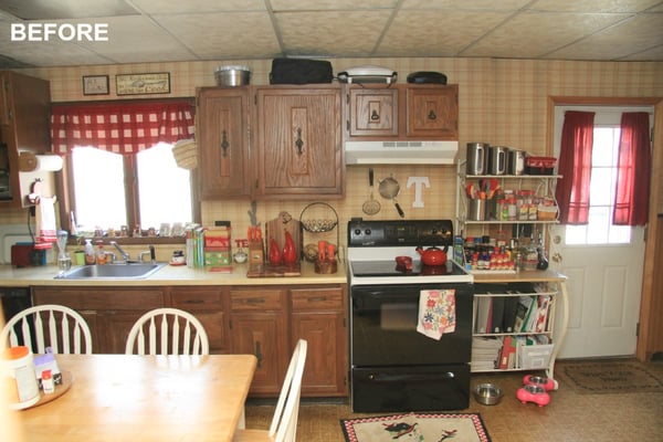
Limited space for essentials made the kitchen cluttered. There was not an adequate area for preparing meals.
The Design Plan
The design plan drawn by designer John Gidding updated the kitchen in the following ways:
- Changed the “work triangle” of the kitchen and the location of the sink and appliances.
- Created functional cabinet space by adding a wall where the old breakfast bar was located.
- Expanded counter space for food prep and seating by building a peninsula.
- Added aesthetics that make the kitchen an attractive place to work in and gather by the use of lighting, adding new flooring, designing a backsplash that unifies elements in the room and by the choice of cabinet finishes and paint that brighten the space. The light fixture over the peninsula and cabinet hardware were selected to add sparkle and style to the kitchen.
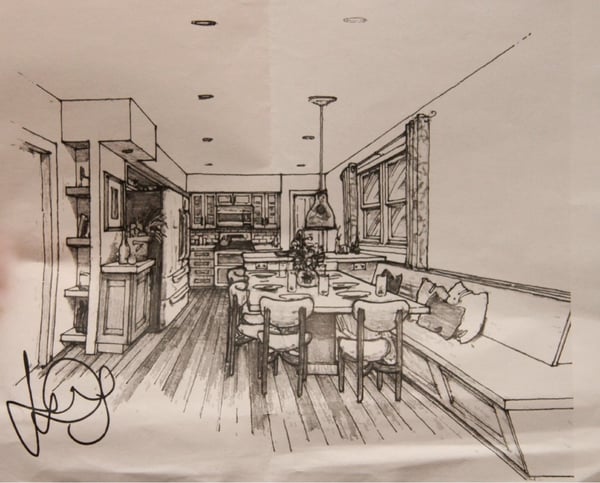
John Giddings’s drawing.
McClurg’s Solutions
1. Constructing a Family-Friendly Kitchen
The first step was to totally demolish the 19’ 2” by 11’ 8” kitchen. Nothing would be salvaged other than the homeowners’ essentials. The vinyl flooring was ripped out and a new subfloor was laid to support a floating prefinished wood floor. Plans for a dual height ceiling were modified due to a soffit. The paneled ceiling, which the homeowners disliked, was replaced with drywall coated with sandpaint.
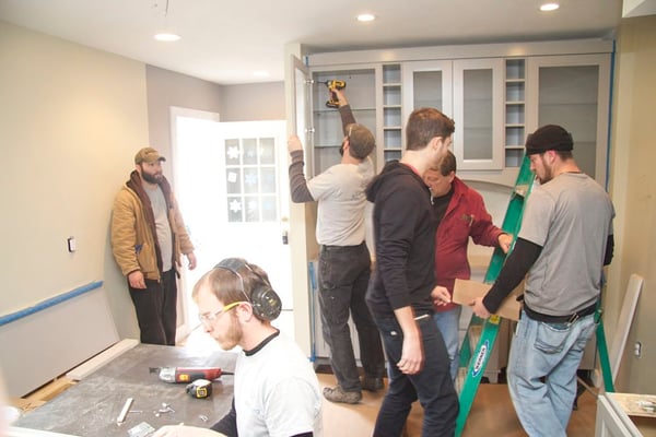
Volunteers from the McClurg team worked quickly to complete the kitchen remodel in five days.
2. Installing Appliances
Appliances were donated by sponsors of The Rachael Ray Show and included a large dual door and dual drawer refrigerator that required some modifications in the plans to fit into the configuration. A new dual oven conduction range, a venthood microwave oven, and dishwasher were also included in the package. Mechanicals had to be updated to accommodate the appliances as well as a sink that would be installed in the peninsula. New wiring would also be needed for the lighting in the room.
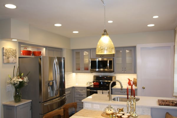
The new appliances, lighting and sink. Lighting includes recessed lights for general lighting, a pendant light and under-cabinet lights for task areas, ambient lighting within glass door cabinets and decorative lighting over niches.
3. Creating Functional Storage Space
Built-in cabinets were used to optimize the floor space in what otherwise had been a crammed kitchen. The plan called for a new wall of cabinets where a breakfast bar had been. Cabinets for glassware and cubbies for bottle storage were added to the wall to create a service bar and space for items used both everyday and for special occasions. Flatware and plates can be stored in drawers. Base cabinets provide space for serving dishes and platters.
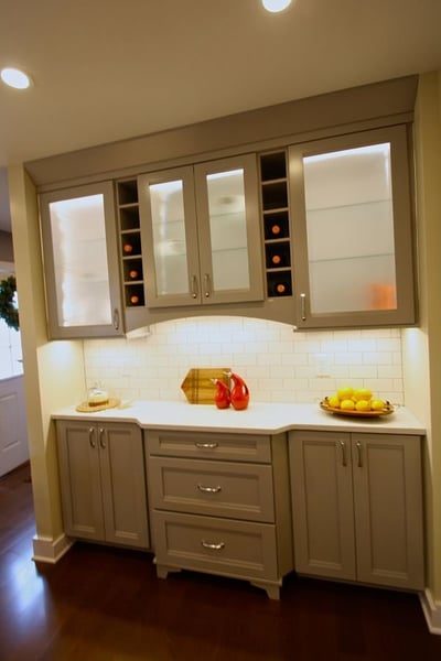
Service bar and storage for glassware, flatware and dishes.
The entry to the kitchen was fitted with storage shelves that could be used as a pantry.
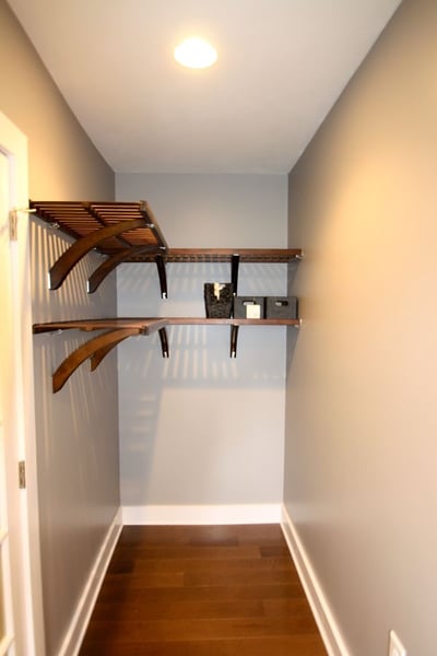
Shelving in the entry to the kitchen creates a pantry area.
Storage over the refrigerator was designed to be both practical and decorative. A niche was built to store and provide easy access to baking items.
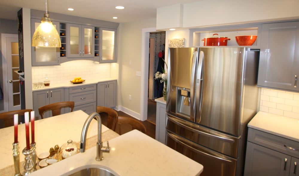
A niche recessed over the refrigerator provides storage for a colorful Dutch oven and mixing bowl.
The kitchen makeover episode can be seen on The Rachael Ray Show website. For additional information about the project, and to view before, during and after photos, visit our community involvement webpage.
Related Posts
Kitchen Design Ideas for Basements and Lower Level Living Areas
If you are planning a basement remodeling project have you considered adding a second kitchen,...
Project of the Month: Kitchen With Two Islands
The kitchen is the heart of a home. It’s important that the space meets the needs of the people who...
5 Ways to Maximize Space in a Small Home
Small homes are gaining popularity among homebuyers. Baby boomers seeking to downsize and live more...
